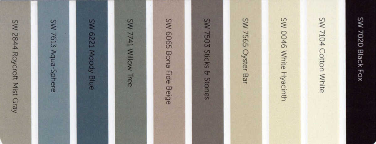
I was recently sent a 2014 special issue by Sherwin Williams about their paint and colors. Included in this brochure were several color palettes. Two of them stuck me as not only beautiful but usable in many home or business situations. Although some of the palettes were bright and colorful I could not imagine using them in most homes.
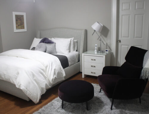
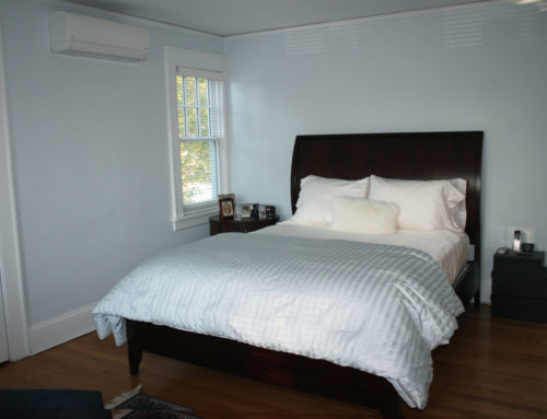
I believe that most people want soft soothing colors on their walls to function as a background rather than shout out “look at me”. I have found that most of my clients want to come into their homes and feel that they are in an oasis of quiet calm. Your surroundings and how they make you feel is most important, especially in these hectic times when our lives our scheduled every minute.
So here are two palettes that fit the bill. They are both sophisticated and subtle.
These colors are a nice mix of warm golds and beiges with cool grays, blues and greens. I also like the contrast between the light and darker colors. The deeper colors can be used as accents. I can see decorating a room or a whole house using some of these colors. Each one goes beautifully with any of the others. Some of the colors can be used in fabrics and others on furniture or walls.
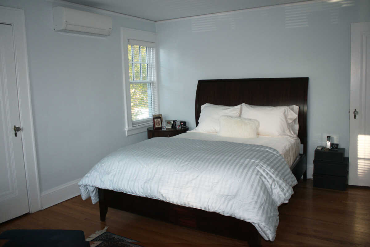
The second palette that I liked was simpler and more neutral.
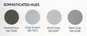
I would love to see these colors used against woodwork painted pure white from crown and floor moldings to window and doors. It would create a clean, crisp, sophisticated look.
If you are in the process of decorating and have the luxury of starting from scratch, consider using a color palette like the ones above which will bring warmth and sophistication to your home and make a lovely statement for years to come.