
A client called me to help choose colors for a house they were building in the Adirondacks. It was too far to travel and we decided to do what I call, “long distance color consulting”. That is we chose colors not on the actual site. It’s a challenge because colors change in different lighting and all the things the client chose like tiles, bathroom fixtures, kitchen cabinets, etc. were things I would see only in pictures. She did have a few actual samples of tile for me to see which was very helpful.
I am hoping the client will photograph the rooms when they are furnished so that I can share them with you but in the meantime I will share the color palette we chose. The house is rustic, set in the woods, on a lake. The entrance and great room is a big open space with a wall of windows/doors that you see when you enter. The windows face the lake. What you see is the view. The client had picked fabrics for the sofa and chairs which had rich greens and reds in them and wanted a warm neutral color that she could use throughout the first floor. The color we chose would also be seen and be part of the kitchen and dining room as well. It was crucial that we pick the right color because everything else would come off of that area.
We chose Benjamin Moore HC-89 Northampton Putty.
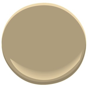
This is one of Benjamin Moore’s historic colors. It is warm, neutral, with a hint of green. It has a certain elegance and because it is one of the historic colors it looks great in rooms with traditional furniture.
Off of the entrance is a staircase that leads to the upstairs hallway. We wanted to keep a similar color but wanted to change it slightly. There are no windows in this hallway to let in natural light so we decided to choose a lighter hue. We chose AF380 Coastal Path.
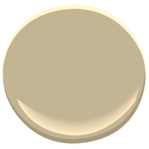
This color is a slightly lighter shade than the HC89 and is a subtle transition from the deeper color on the first floor. This color is part of Benjamin Moore’s Affinity Collection and harmonizes so well with the other color.
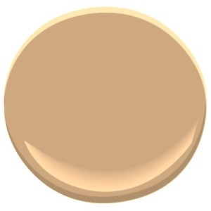
The other colors we chose were for the master bedroom suite and bath which were also on the first floor. This is a private area completely closed off from the great room. It was also a room with a great view that received a lot of light. The client wanted a warm color. We chose 2161-40 Acorn Yellow, a bold saturated hue that livens up the space. It is a pure, deep, clear color.
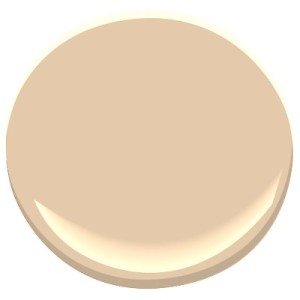
We chose a slighter lighter hue for the master bath that compliments the bedroom 2161-50 Yellow Squash. Both colors are part of Benjamin Moore’s Color Preview Collection.
These two separate areas of the house have limited palettes that express what the client wanted in each space. In the living area she wanted a neutral palette that would show off the architectural beauty of the house and be a rich background for her furniture. In the master bedroom suite she wanted warmth and depth, a place she could escape to and be surrounded by pure clear color.
